Nice Work #2
Rosemary’s Baby, by Stephen Frankfurt, 1968
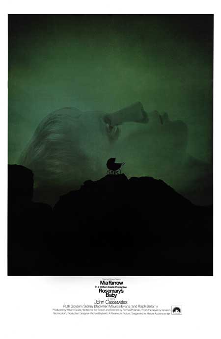
Ah, here we are. A bona fide classic, by a bona fide advertising guy.
Or maybe not. Let’s just acknowledge this so it can be got out of the way at the beginning: Steve Frankfurt is credited as the creative director for this work. The work fell under his aegis and so, while acknowledging that many of the ‘Frankfurt’ designs were the work of Phillip Gips, or at least a collaboration between the two – and possibly also Aubrey Balkind – I’m going to have to attribute this design to him. Success, as we all know, has many fathers (and in the case of the Alien tagline, at least one mother). And other than watching Mad Men I have not the slightest idea how an ad agency actually works, let alone a specific agency forty years ago, so I have nothing to offer on the particulars of ‘ownership’.
(Aside, squared: imagine what it’s going to be like for future key art historians, now that many designs are a grab-bag of elements from a number of different shops crudely scotch-taped together by whichever place charges the least for finishing.)
Every modern bio of Frankfurt contains a line to the effect that he was some kind of proto-Don Draper – a proper ad guy, at a time when ad guys were the guys to be. His approach to movie marketing was revolutionary – he would design the key art, the trailer, the press ads and the title sequence as one unified piece. Saul Bass, of course, had also been working along these lines for some time, but Bass’s idiosyncratic work was as much a stylistic choice for the project rather than purely in service to the project – Frankfurt’s work is by contrast more ‘of the piece’ – strong, emblematic of the film and slick as brylcreem through a pocket comb. If Bass took movie advertising closer to art, then Frankfurt brought key art closer to advertising. Perhaps for the first time, film advertising became as smart and stylish as advertising elsewhere: it’s practically impossible to view the Rosemary’s Baby key art, for instance, without thinking of the Volkswagen ads that were prevalent throughout the mid to late sixties.
Rosemary’s Baby is a by-the-books things-that-go-bump-in-the-uterus genre flick elevated somewhat by Polanski’s firm grounding of the film in the real world (or at least a real world where people live in the Dakota and get their hair styled by Vidal Sassoon) and the solid performance of Farrow in the title role (Cassavetes spends most of the film waiting for his pay cheque so he can go and make Faces). Robert Evans claims in The Kid Stays in the Picture that he always wanted “the little Polack” to direct the film as soon as he read the book. It’s a typically inspired choice, of a piece with Polanski’s other terrors of city living, Repulsion and The Tenant. But let’s not overburden the film – it’s basically a silly piece of Crowley-froth – and to its credit that’s something the key art doesn’t shy away from. The brimstone-and-sulphur green overlay, the craggy, hellish outcrop (apparently Central Park) is all delightfully over the top. The genius tagline “Pray for Rosemary’s Baby” (oddly, not included in all the versions of this onesheet) is pure shlock – add some italics and an exclamation point and it’s the 1950s all over again. But the thing that makes this artwork special is the bravery of it – look at the image again. It’s entirely uncluttered by text. Visualising the poster before I wrote this I had transplanted the cast and title into the black and reversed it out, but here it is – an acre of menacing black space crushing the title into an area that these days wouldn’t fit the logos of the production. There’s a confidence here in the unsaid, and the classic adman’s art of the tease in full effect. What we aren’t seeing is more important than what we are – a lesson most key art would benefit from.
Success has many fathers, but it also has many followers. Clients and designers alike are never shy of attempting to replicate success (something I’ll be discussing next week). For instance, this may be the first example of the big actor head hovering over a silhouetted landscape, a trend that 45 years later is still in full swing. Shortly thereafter a number of other designs bearing marked similarities to this art started to appear, not least of which was Frankfurt’s (or Gips’) own Downhill Racer, the following year – essentially the same trick, pulled twice, receiving a standing ovation both times.
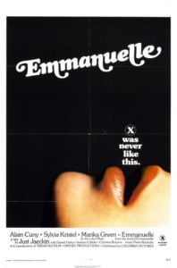
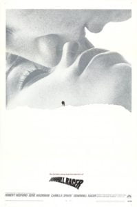
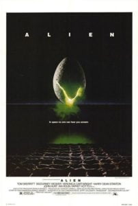
More Steve Frankfurt: There’s a great contemporary BBC documentary about him from the Young & Rubicam days on youtube (*link now broken, sorry).
Coming up:
Next: The Social Network and the perils of success
