A Landscape of Fear
This article was originally written for The Territories in 2015.
The Sum Total of my Understanding of the Australian Landscape Prior to my Arriving in Australia
- I’m, what, seven years old. The slowly-forming bush paintings of Rolf Harris as painted during his 1970s heyday Rolf on Saturday, OK that are now so tinged with sadness as to render any memory of their merits now worthless.
- I’m 16. Watching television in the UK, I notice the following. Whenever a character in Home and Away goes to the beach, nothing of any import happens. They will have a discussion, maybe start or end an argument. But no one gets stung by bluebottles, or eaten by a shark. No-one drowns or breaks their neck in the surf. I also notice the following. Whenever a character in Home and Away goes into the bush, they will invariably become injured, lost or in some other way dreadfully imperiled. This is because the bush is a scary, dangerous place. Even to a child living halfway around the world, this fear of the landscape, while valid on many levels, actually seems to be about something else entirely. The mask fits oddly and is plainly visible as such.
Quite what it hides though is at this stage beyond my understanding.
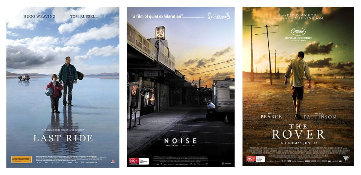
 “Plot goes to character” is a golden tenet of modern screenwriting. Put simply, it’s not the events of a movie that are important, it’s how the events affect the characters that is crucial to maintain and develop viewer interest and empathy. Bluntly, this is why Joss Whedon makes slightly more interesting films about people fighting CGI robots than Michael Bay. Characters are the engine that keeps the plot moving, and indeed since the dawn of cinema the characters, not the plot, have been the tools to entice the viewer into the theatre in the first place. As the poster is the most minimal distillation of the world of the film, it’s the poster that reflects this truth most strongly. Character becomes the whole, and everything else is likely to be discarded in the haste for exposition (and acquisition).
All of which is to say when I was asked to discuss the role of landscape in Australian key art (to use the preferred euphemism – preferred I fear simply because it adds the flimsiest silk drape of legitimacy to what is bare naked advertising), my initial response was what the fuck?
Aside: The Basic Tenets of Movie Poster Design Theory as Related to the Author by An Inebriated Cinema Owner at The Gold Coast Movie Convention
“It’s not art. No arty shit. You need the punters to see people on the poster. They see people on the poster, they know they’re getting a story about people. They don’t see people on the poster, well, they don’t know what they’re getting into, do they? That’s not art mate, that’s economics.”
The challenge of landscape photography is to communicate the sense of scale and wonder the landscape represents while containing it within a frame. To communicate its majesty and scope when the very thing that makes it so impressive is the first thing removed in the process, is no easy task. It requires skill and a keen eye, along with, frankly, a love for the landscape. The widescreen format of film is an assistance but regardless it takes a special cinematographer to effectively sell any vista through the confines of the screen’s borders. The portrait nature of the movie poster reduces this even further, and is much more suited towards depictions of the person, vertical creatures that we generally are (hence, I guess, ‘portrait’). Quite why the movie industry has chosen (with one exception) to use a vertical format (ie the poster) to sell the wonders of a landscape format (ie the film) is one of the great mysteries of the age. The British went their own way and have employed for many years the ‘quad’ poster format, which not only more effectively reflects the movie, at least in its basic proportions, but also keeps a cottage industry of graphic designers gainfully employed redesigning posters for every film that gets released there. Given our relatively expansive Australian landscape it’s an ongoing source of confusion and shame that we didn’t import quad format posters from the UK (especially given our open door policy to far less desirable British imports such as rabbits, murderers and Tony Abbott). Perversely the national format for movie posters (at least until the 1950s, and still used quite widely until the 1970s) was the daybill, a vertical slice of image suitable for depicting landscape only as viewed by a medieval archer about to defend a castle. It would be tidy for this article to suggest that the format and its limitations were part of the national psychic terror of the bush and all it represents, but it seems to have simply been a holdover of the conversion of theatres to cinemas across the country.
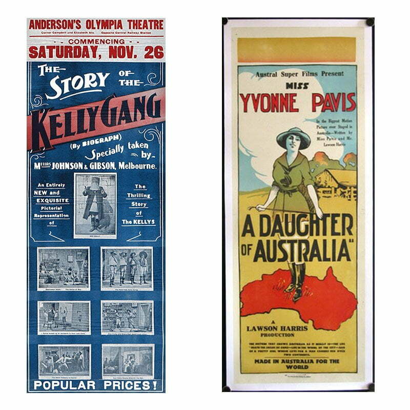 Australia created what is commonly regarded as the first ever feature film, Charles Tait’s The Story of the Kelly Gang, in 1906. In a number of ways this film was a clear sign of things to come – the glorification of criminals (specifically those from Victoria), portrayals of Ned Kelly by non-Australian actors, and the complete lack of anything approaching an acknowledgement of landscape in the poster were all themes that would be returned to a number of times over the next 100 years or so.
 The early years of Aussie cinema (and thus the poster) focus largely on the white experience as glamourised in every other artform and enshrined as the ideal model ever since – the battler on their selection, overcoming the oppression of both heat and authority to carve out their little idyll from the unforgiving, testing land. There is little love of country, and while the nature of posters is – as mentioned – to err towards character rather than landscape, the avoidance of any value placed on the country other than as a testing ground is peculiarly strong. The act of escapism has for so long been central to the cinema experience that it’s probably unsurprising to find that other countries are more willing to celebrate the sense of place in Australian films than we are – we live here, after all, and it’s not exotic to us (goes the theory). It’s fascinating to see the gulf between how we choose to represent ourselves and how others choose to see us. And yet the disparity seems somewhat askew. Because for most of us, the bush is exotic. It’s somewhere most Australians will never go. And the fear of the land seems to go deeper than running out of gas, or being bitten by a spider.
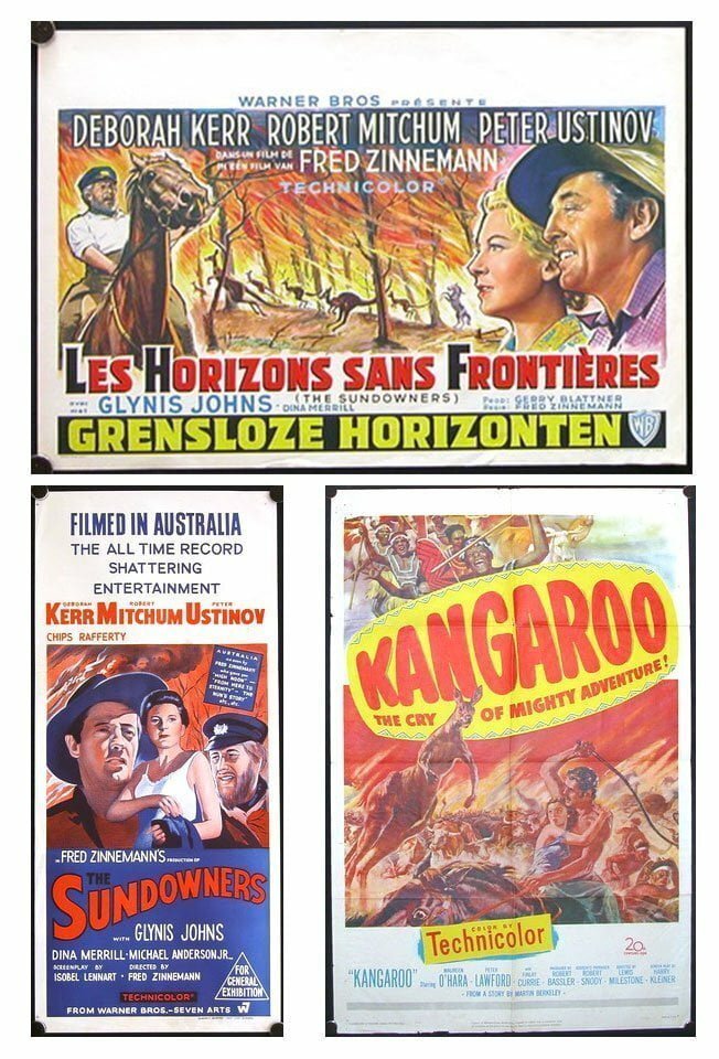
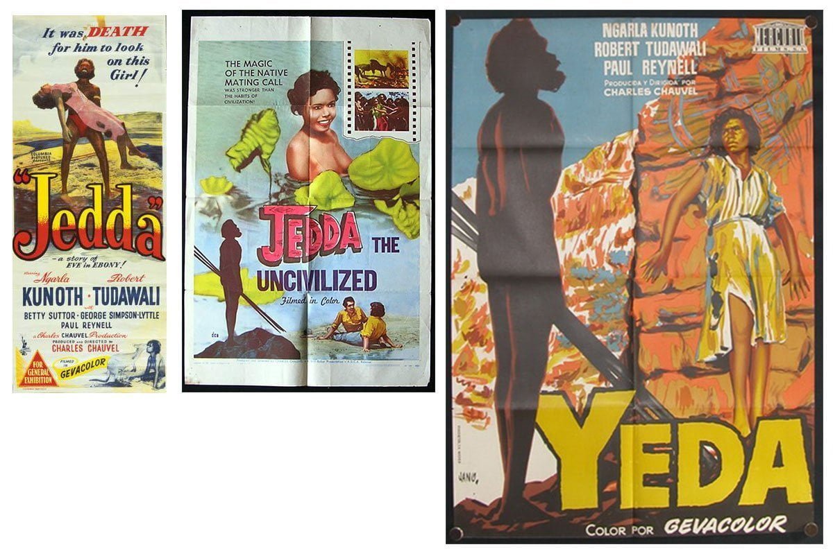 The complete absence of blackfella faces until Jedda in 1952 (and very infrequent glimpses since) could be seen as a collorary to this – our acknowledgement of the existence of a people with pure connection to the land is as much a void as is our ability to deal with the weight of a past wrought in blood and terror. The Australian daybill for Jedda is a lurid thing, clearly painted by someone with no actual knowledge of what the desert actually looks like (although in 1952 this is rather more forgivable). If we look to how we’re represented in the mirror of the overseas poster – this beautiful Spanish poster (from the collection of Vesna Babic, as are many of the other images here) has a wonderful sense of feeling for the landscape of the film (and the characters therein). This is a pattern that repeats endlessly throughout the history of Australian posters – an inability to celebrate a unique landscape that renders our films immediately individual, and offers a wealth of gorgeous imagery that we seem to be uniquely distanced from. Unfortunately as the custodians of that wealth, we are prone to rather failing to spend it properly, and perhaps we can be blamed that the rest of the world often chooses to just focus on the kangaroos.
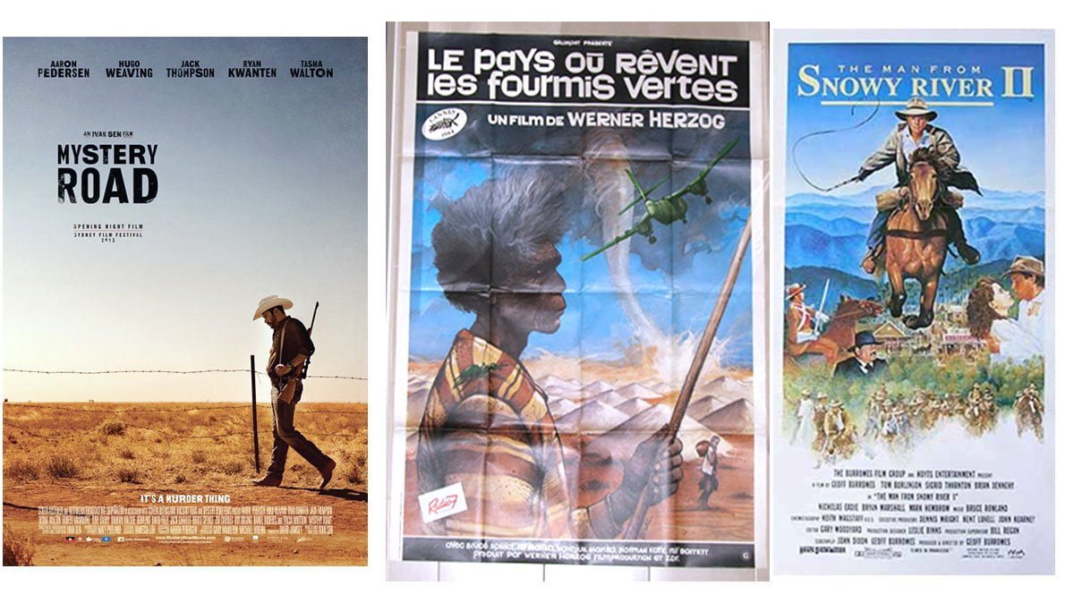
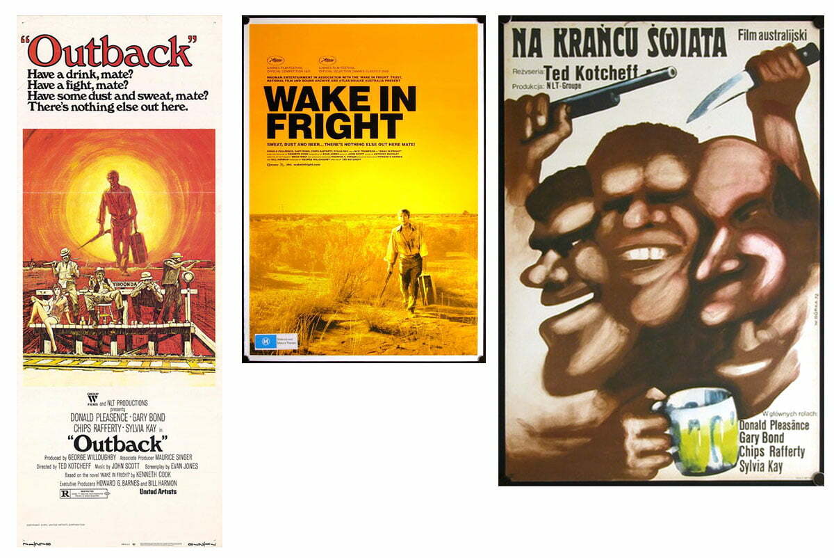
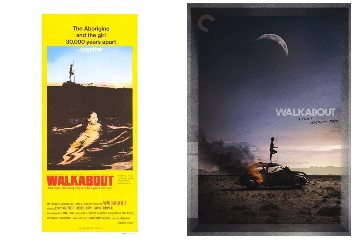 It isn’t until the birth of the Australian New Wave at the turn of the seventies that the first acknowledgements of the white place in the native landscape was interrogated in both the films and the artwork that promoted them. The bush is often still used as a backdrop of impending doom, but the real terror comes from the people there. In Walkabout (1971) Nic Roeg takes Jenny Agutter and her brother from their absurdly insipid white bread lifestyle and in a moment of horror leaves them to the landscape where, guided by a young David Gulpilil, she comes of age while resisting at every step making a connection with the country. That the contemporary poster pruriently promises skinnydipping along with a tagline that might most charitably be classed as ‘of its time’ shouldn’t diminish the ideas present in the film (expressed much more appropriately in the Criterion disc artwork from 2014). What’s rare about this film is that the landscape itself is a character, rather than simply an obstacle to overcome. Culturally-cringing film buffs are often keen to relate this to the story being told by a non-Australian; I think it would be more telling if it were not for other films exploring similar themes at the time, albeit with less finesse. Wake in Fright (1971) also features a character trapped in the landscape, and the horror here is the other (white) Australians he finds himself with. The original daybill has a great sense of character and the recoil felt by the protagonist as he makes his way towards releasing his inner bogan, and this is doubled-down on in the amazing Polish poster which abandons any notion of environment and focuses on the rowdy beer-swilling mob, crowding out the text with an ‘in your face, mate’ vigour. Interestingly, the re-release artwork, though a fine, rare example of an Australian landscape on a movie poster (printed in a gorgeous flouro orange), completely removes any mention of this central conceit of the film. In the intervening 40 years had the landscape become relatively more frightening or had previously unpalatable traits of the Australian character become more celebrated?
Regardless of the rehabilitation of the sterotypical bloke in society, in cinema the landscape remained the source of all things hostile, impenetrable and hellish. A place where only bad things happened. And boy, they happened a lot. As Quentin Tarantino says in Not Quite Hollywood,
“If you grew up watching Australian movies, there were like, two cities, and there was one highway between them filled with marauding gangs on motorcycles, looking for people to fuck with.”
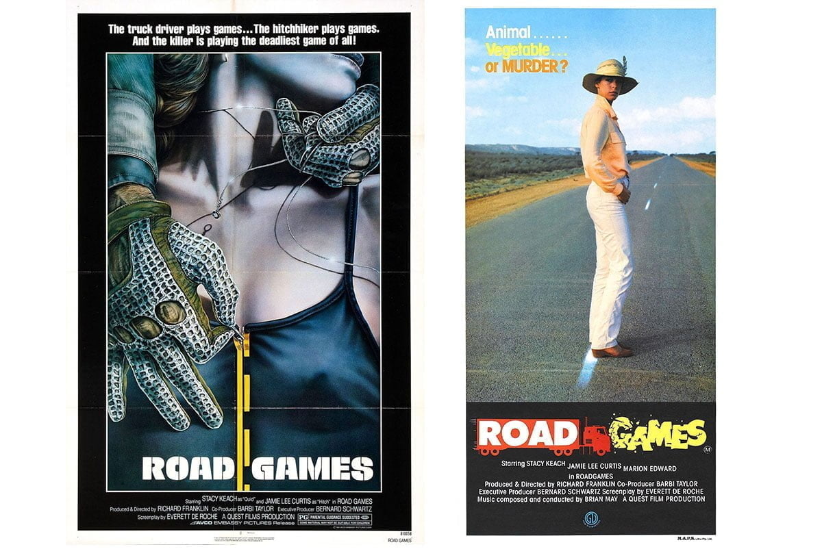 The Ozploitation years through the seventies and early eighties may have only produced a couple of bonafide classics but the central Australian idea that leaving the safety of the suburbs was a terrifying notion thrived like lantana in the low-budget world of shlock and action. Everywhere the landscape was being torn apart by gangs, slashers, murdering bands of bikies and men wearing fetish gear shouting at Mel Gibson. The local posters themselves were generally an uninspiring bunch, with the better efforts often being the overseas versions, as can be seen here with Road Games and Razorback (both of which local versions are lamentable efforts, the Razorback one particularly appropriately is a pig’s ear of Boris Vajelo’s artwork).
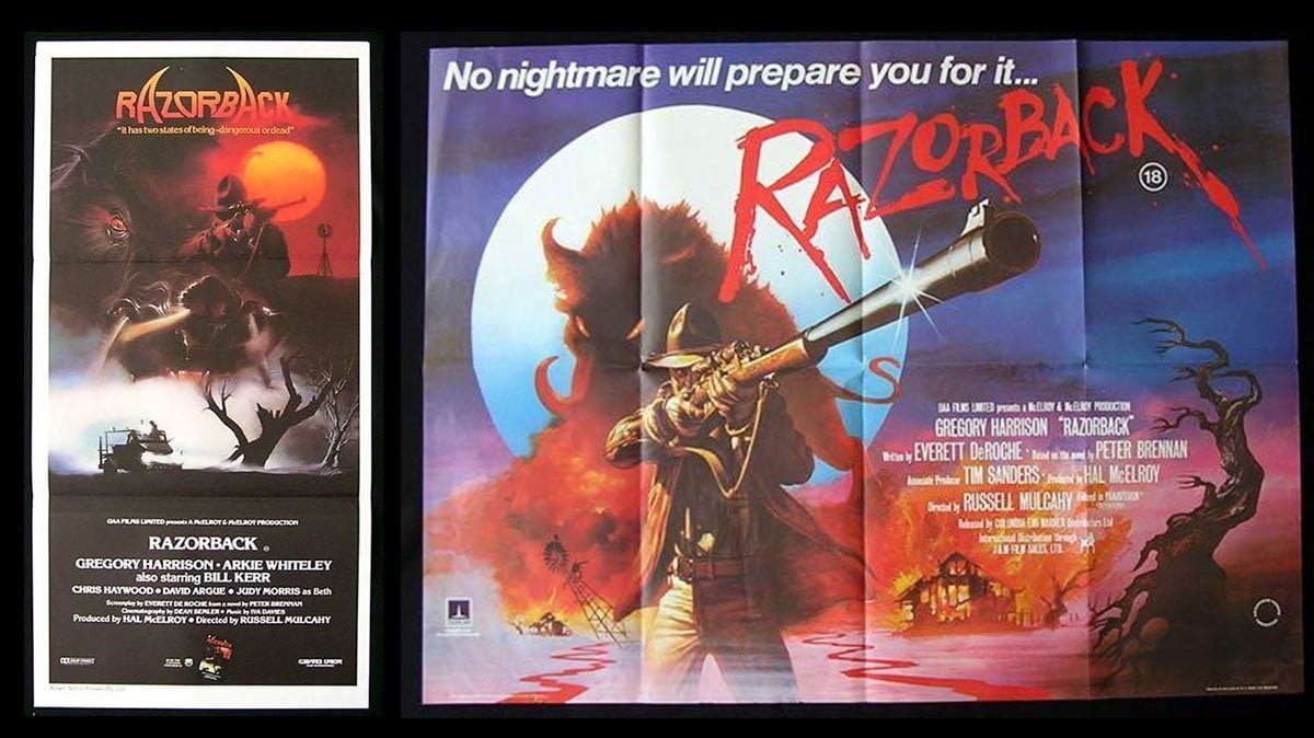
In the meantime the “honourable white man overcoming the native landscape” trope plodded on as it had done since the 1920s, as it likely will do for ever more, accompanied by an annual rehash of the Gallipoli story.
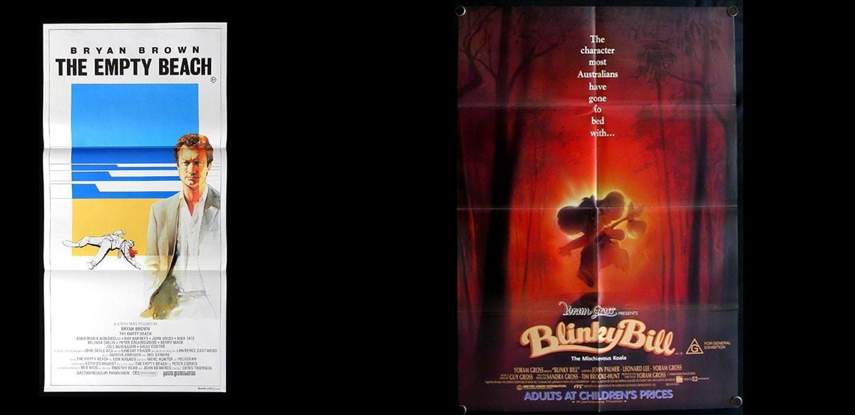 This is not to say there wasn’t good work being done in key art – just check out the wonderful 1985 (and wonderfully 1985 it is too) piece for the not-often-remembered The Empty Beach. There’s a dead body on the sand and it still looks more inviting and pleasant than any depiction of the bush in the previous 80 years. Even when we try to make the bush appealing it fails – here’s the key art for the children’s film Blinky Bill, The Mischievous Koala (1992). While the main onesheet is a successful enough picture of pastoral innocence (apart from the blaring commercial exhortation of ADULTS AT CHILDREN’S PRICES) the second is pure nightmare fuel. The tagline is tone deaf and the brooding forest silhouetted against a hellish glow wouldn’t look out of place behind John Jarratt dismembering a backpacker for Wolf Creek 3 (Greg McLean, you have my number).
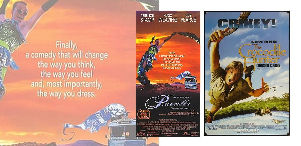 Of the glorious international success of the Crocodile Dundee films and the “Camp Australia Trilogy” (Muriel’s Wedding, Priscilla and Strictly Ballroom) of the early 90’s, only Priscilla ventures outside on the poster. This artwork, along with having perhaps the greatest tagline in Australian movie history, is something of a curiosity. The beautiful freaks spurned by suburban Australia (Priscilla herself spends most of the movie with AIDS FUCKERS GO HOME sprayed on her side) are presented as something like aliens and thus the alien landscape of the bush is a relatively safe place to play. This is a celebration, even if it’s a skewed one, and so it is for the poster. One could make a note that the more draggy elements of the film are toned right down here, but in relative terms of representation of people in landscape it’s something of a glorious display.
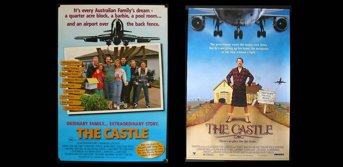 Oddly, we don’t present our urban landscapes particularly well here either. The suburban sprawl feels too featureless, too ordinary, blank and bland to be celebrated. As someone who moved an Australian crime drama to the light of Renaissance Italy in front of a backdrop shot in a Parisian cemetery to avoid having to take photos of grey old Melbourne (for Animal Kingdom) I am probably not the person to celebrate the beauty of Down Under Urbanity. But there are so few examples of it being done well I fear it is only vanity that leads me to believe I am in any way unusual in that respect. To wit, it’s quite shocking to see the artwork for the Australian Battler’s Best Ever Australian Battler movie, The Castle (1997). This is a movie about a knockabout family of true blue battlers battling the Big End of Town to save their house, the art for which not only crops out most of the house in question but then hides the rest of it behind a fucking tree. True, the Aussie version is focusing on character but much better art (here the US version) comes from also allowing the core element of the plot to maybe have a peek. The Australian version seems somewhat …embarrassed.
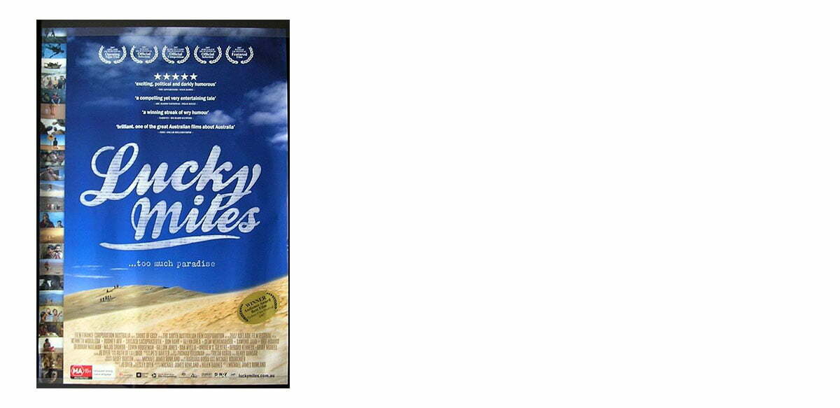
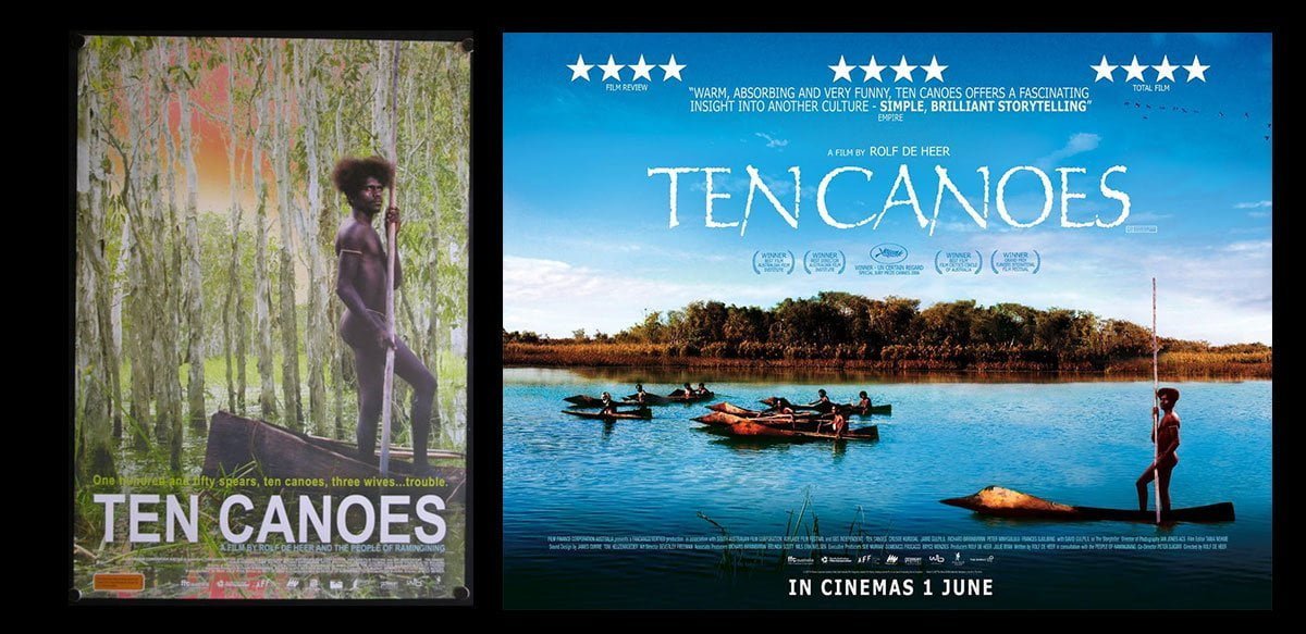 And perhaps it’s this creeping sense of embarrassment that is preventing us from celebrating our landscapes in our key art. Compare the bizarrely cramped, claustrophobic artwork for the indigenous shaggy dog story that is Ten Canoes with the blue sky adventure promised by this French 3-sheet, or the UK quad. Hell, compare it to the artwork for Crocodile Hunter… (Not that this choice of poster affected the box office of Ten Canoes one iota, but that’s an article to be written by someone whose family’s livelihood doesn’t depend on people paying them to make movie posters). Understand, again, that this is a poster about character and not landscape, but maybe acknowledge that for people to drag themselves out of their homes into a chilly theatre, paying to watch slightly out-of-focus films projected using a bulb running at 60% of its intended wattage, requires slightly more self-serving promotion and the offer of something wonderful than is displayed here. Or indeed in the artwork for the quite lovely refugee comedy-drama Lucky Miles, which is about a trio of refugees who make land in the far north and naively decide to walk to Sydney, and is very much worth tracking down despite its poster which perplexingly hems in the immense landscape of the poster with tiny, unreadable images down one side. I have spent many hours staring at this artwork wondering what odd process led to this image being created and I fear my inability to even start to fathom it will pursue me to the grave.
It’s the very purpose of movie posters to trumpet and celebrate the work they are advertising. The quality and scope of films we make in Australia are on par with any other country you care to name. The landscape those films are made in is exotic (even to us) and expansive and often magnificent. But the artwork shies away from celebrating the sense of country (or even to celebrate the film as a whole). I often wonder what this reserve is due to. Maybe just the fact of the trumpeting – is unseemly. Maybe we don’t want to be seen to be proclaiming our excellence (at least until Sundance or Cannes give us an award to validate our efforts). Maybe there is something deeper at the core of the Australian experience that makes us doubt ourselves and our relationship to the country we live in. Some psychic hangover. Some fear.
We seem embarrassed about the places we live in, and fearful of the people that live there. We seem fearful of the places we don’t go, the faraway places that make our country special and unique. We’re fearful of the people who live there, too. They don’t seem to trust us and we really don’t want to find out why. We’re fearful of the answers. The only place we’re not fearful of is the 20 metres of beach down the road that will definitely kill us if we take half an eye off the rip, or the jellies, or the sharks, or the crocs…
And until we deal with this fear, those poor kids in Home and Away will never stand a chance next time they head into the bush.
