Nice Work #3
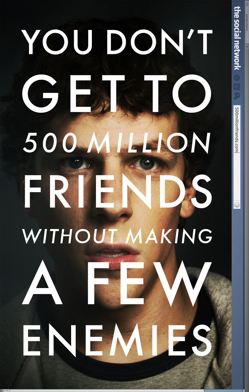
The Social Network, Neil Kellerhouse, 2010
In advertising I don’t think you can be disingenuous at all. With social media and the speed of communication you have to be really honest and up front about what you have with your property and be true to the story. So it’s all that and then trying to figure out an interesting and compelling way to communicate that. And that’s the hard part.
Neil Kellerhouse, interviewed by IndieWire
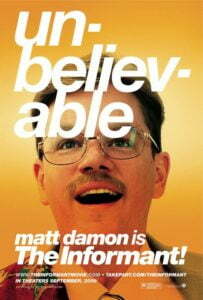
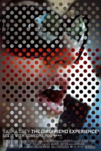
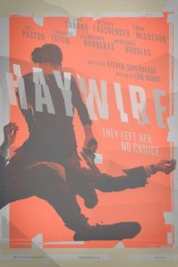
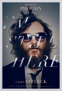
I’m self-taught. An autodidact, if you want to get fancy and sound like being self-taught is a good thing. And being an autodidact has its advantages, sure. But it also means I have really weird gaps in my knowledge. In certain areas, I’m a numbskull. Typography is the big one. Graphic designers are supposed to be typography totalitarians. But for me, as long as it answers a few questions – Is it legible? Does it add to comprehension? Does it feel right? – then it’s done. I know. I know that if I ever want to be a proper graphic designer, then I’ve got to sit the fuck down and read a book about typography. And very occasionally I diligently open a ‘beginning typography’ book and I’m asleep in about five seconds because it’s the most boring thing in the world. Reading about typography is like printed instructions for dancing, to entirely misappropriate Stephin Merritt. But even a typographical philistine like me knows great typography when he sees it. Neil Kellerhouse is brilliant at a heck of a lot of stuff, but he is really, really great with typography. The tricks he can do with type would make a $500 hooker blush. In particular check out his range of designs for Steven Soderbergh, a body of typographic work as far-ranging and eclectic as the films themselves:
The typography for The Social Network is really simple and really divine. It’s a bugbear of mine when bad designers try to justify text in short line widths, because it often obfuscates the meaning of the sentence. And here it’s close, it’s really close (“A FEW”), but he gets away with it because he understands the rhythm of the statement and the beat of the language and how to express it clearly and simply and in sympathy with the image behind it.
Just look at that tagline. That’s the sort of tagline that only comes up once in your career, and it’s perfect. It makes a film about Facebook – and think about that hideous idea, for a moment – sound like a noir thriller. Suddenly the notion of watching a film about a kind of dull young man who had a good idea sitting at a computer is one worth investigating.
When we first wrote that line it was “300 million friends” and I said, “let’s just make it 500 million.” That was December ’09, we had that poster pretty much nailed down for an October 2010 release and [I said] we’re just going to go for it and get 500millionfriends.com and see if it gets there. At the time we decided to go with [that tagline] it seemed a little bit ambitious because there was all those privacy issues going on. So I thought people would be abandoning ship on Facebook, so we got 400millionfriends.com just in case. We were really hedging our bets.
ibid
The tagline here is the poster. Or at least, it’s the hook. Plastering text (very) artfully over the shot of Jesse Eisenberg is a bit of a Kellerhouse trademark move, or at least as much as he can be said to have one.
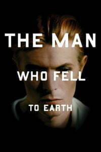
I don’t think it’s his best typography (that would be the fractured Didot for I’m Still Here) and I don’t even think it’s his best plastering-typography-over-the-protagonist’s-face artwork (that would be the head-slappingly concise Man Who Fell To Earth cover for Criterion) but the purity of the concept here is just amazing: Step back and look at it. Take it in. This is what every client who wants to replicate this poster for their film misses, and it’s so pure and so obvious that it can skate under you without your noticing:
This is ‘Mark Zuckerberg”s profile picture.
That, very simply, is why this image works. That is why, when every client under the sun spent all of 2011 asking for ‘a Social Network-style poster’, it never worked. Without any words, and I would wager even without that blue bar on the right hand side, it’s because of that image that you know that this film is a portrait of the guy that made Facebook. And that, basically, is all you need to know about the film. Do you need to know it’s by Aaron Sorkin? Do you need to know that David Fincher is directing? If you’re the sort of person who needs to know that stuff then you know that stuff already. If not, well, there’s the web address, in the web address box. These days (and often on this site) folks are going nutso for minimalist poster design, but honestly it doesn’t get more minimal than this – no actor headlines, no credit block, no reviews or quotes or four-and-a-half-stars from whoever.
And even a numbskull like me can appreciate that.
