Nice Work #1
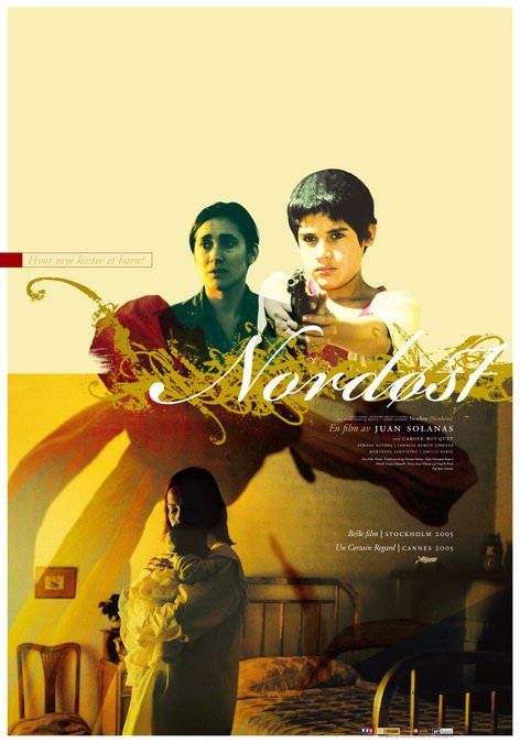
Nordeste, designed by Egil Haraldsen, 2005
“Generally I would say that there are too many designers who follow the international trends rather than think for themselves. Of course, society needs more aesthetes. I will be happy to be a politically independent Minister of Taste for future governments – and I shall have unlimited power, a large screen and be allowed to smoke in the office.” ¹
I first became aware of the work of Egil Haraldsen in 2005 when the producer John Maynard proudly thrust the Norwegian artwork for Look Both Ways under my nose with a flourish. “Now that’s a poster, mate,” he said. And he was right. Compared to the design I’d overseen for the same film the previous year it was full of intent, movement and style. As a bonus, you could actually see what was going on, and that it was a film with people in it. It was a huge improvement, I had to grudgingly admit.
(An aside: A few years later, Maynard drew upon Haraldsen’s services for the My Year Without Sex key art. Not my favourite piece of his, but as a visual representation of Sarah Watt’s surely-wilfully-ugly depiction of chaotic domesticity it’s pretty much on the button. “He’s a lot easier to work with than you mate,” was Maynard’s ebullient summation of the process. His promise to “just give Egil a ring” tends to get regularly wheeled out with a grin when I fail to immediately produce an award-winning first draft on anything we work on together.)
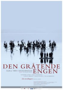
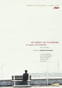
Throughout his career Haraldsen has worked mainly a book designer, although he has produced an enormous volume of work (over 100 pieces) for the Norwegian film distributor Arthaus. His work for them is instantly recognisable as part of a continuing whole, each film maintaining its own identity but seamlessly fitting into the overall grand design.

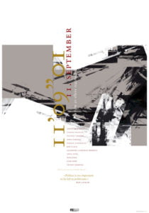
It’s a general rule of effective key art to maintain some respect for the aesthetics of the film in the design, although the common interpretation of that rule is a lot more literal than Haraldsen’s, and this is where his focus as a book designer is absolutely apparent. Not just because his designs ignore convention, but rather that the visual aesthetic does not appear to be the most important aspect for him to express. By necessity, working on visual solutions for books lends itself to more interpretive and inventive presentation of the content, rather than the lazily literal nature of working in the service of a visual medium. And it’s this ethos that Haraldsen brings to his work.
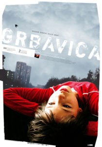
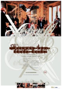
I love that his sense of proportion feels bracingly pedantic (although he claims to not think of the grid or the golden proportion when he works, blaming instead a “classical art education and years [of] experience”) but what is overlaid on this solid foundation is often dizzying in its lack of respect for the status quo. Huge negative spaces command the eye, while free-floating images crash into each other, splintering and breaking across copy and art.
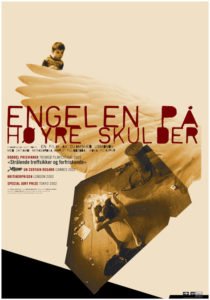
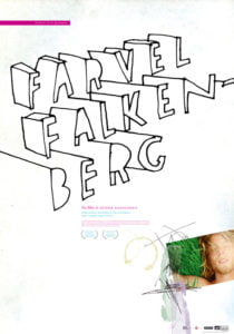
The designs have an astonishing vigour to them – the collage of elements chopped and dropped with seeming abandon to produce something startling and unexpected. There’s definitely a touch of David Carson and Neville Brody in there too; how could there not be, with the incredible typographic confidence on display – multi-layered, chopped-up, obstructed text confusing and informing in equal measure. And the billing blocks! The tiny, wonderful, screw-the-film-poster-rhetoric billing blocks.I love them.
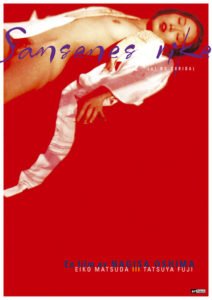
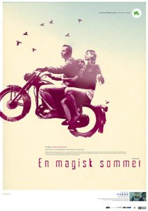
Finding just one piece to pull out of such an amazing portfolio was almost impossible; I’d have been happy to use any of these images as the featured piece. But the Nordeste artwork is such a complete summation of Haraldsen’s style: the negative space, the unusual cropping, the rigid structure and the chaotic collage – it’s all there, wonderfully expressive and inviting. And after all, that’s its job. And I remember seeing this design above all the others (well this and maybe the artwork for Sztuczki, above ) and being fascinated by it. How was it possible to design such a thing? How did all those decisions get made? What were the reasons behind them? Where the hell were the sort of clients that would not only encourage this kind of design, but actually use it? How much was a flight to Oslo?

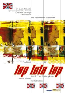
Even in the few years since I first became mesmerized with these questions, the wider industry has come some way towards reconciling itself with the work of Egil Haraldsen. You can see it most clearly in Eric Skillman and Sarah Habibi’s Criterion Collection designs, always at the vanguard of interpretation. But even outside of Mount Olympus, things are slowly and surely progressing. Boundaries are being pushed and new ideas are slipping through the net every day.
Of course there is a general acceptance of very poor work throughout the business: lazy steals, pre-chewed slop, tired template trash. But slowly and subtly, year on year, a creeping bravery is starting to take hold at the fringes. Clients are less and less dismissive of designs that even five years ago they would have baulked at.
Note ‘less dismissive’ rather than ‘accepting’, or ‘happy’. We still have a long way to go yet, most of us.
Coming up:
Next: Steve Frankfurt and Rosemary’s Baby
